Announcement

Collapse
No announcement yet.

New kits 2011/12 thread - The good, the bad, and the minging...

Collapse
X
 
  • Filter
  • Time
  • Show
Clear All
new posts

    New kits 2011/12 thread - The good, the bad, and the minging...

    Arsenal -Massive badge!


    Chelsea - Too much white?


    Liverpool (away) - very decent!


    #2
    That Arsenal shirt looks pretty nice on the players.

    Are there any teams that play in black kits at the moment? It strikes me as being harder to pick out on a pitch than a brighter shirt would be.

    Comment


      #3
      Many a black kit around or bin around. Man Utd, Valencia, Chelsea, Liverpool (last 2 seasons), Milan, Bayern, Man City, Atletico, Germany...

      Comment


        #4
        Stoke City (away)


        Everton


        Milan - Nice!

        Comment


          #5
          Originally posted by hoolak View Post
          Many a black kit around or bin around. Man Utd, Valencia, Chelsea, Liverpool (last 2 seasons), Milan, Bayern, Man City, Atletico, Germany...
          I guess I'm over thinking it!

          What's going on with that Everton collar? Are they playing with robots next year? Milan kit is a bit too stripey

          Comment


            #6
            You get a free beach towel if you pre-order the Arsenal one, wouldn't be buying a Fabregas one in June, plus I'd say a RVP, Arshavin or Bender one would be a bit of a punt too.

            Like the big badge, is like those really naff chavvy Ralph Polo shirts with the life-sized shetland and pony on it.

            Comment


              #7
              Chelsea one definately has too much white on the shoulders but they're probably trying to give it a distinctive look. Going for a 70's feel.

              Guess the critisism of Addidas using a stock base for all their kits caused them to make an effort on that front.

              Comment


                #8
                Adidas seem to be stuck in a bit of a creative rut. They can't make their mind up whether to make something new and refreshing or keep it old school, but with a boring dash of modern.

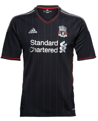
                Rumour has it that Liverpool will be leaving Adidas for an American brand called Warrior (Lacrose, Hockey?). Sounds scary, but the deal is supposedly going to be worth ?25m. Could look new and refreshing or simply rancid

                Comment


                  #9
                  Originally posted by hoolak View Post
                  Adidas seem to be stuck in a bit of a creative rut. They can't make their mind up whether to make something new and refreshing or keep it old school, but with a boring dash of modern.
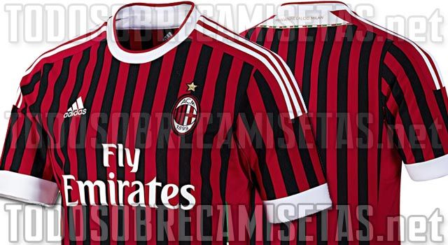
                  Yeah, that AC Milan shirt is almost exactly the same as this season's Nike home Arsenal shirt, in different colours.

                  Comment


                    #10
                    Warrior is owned by New Balance, I think. Its 25mil per season, the biggest deal in the Prem at the moment if its true. Hopefully that'll mean decent merchandising in America.

                    Labron James was wearing a Liverpool shirt in his most recent post match press conference. Surely people in America wont be influenced by that kind of guff.

                    Comment


                      #11
                      Well there's another positive. I love my New Balance 574/6 trainers

                      Comment


                        #12
                        That new AC Milan kit looks horrible, the thin stripes just seem wrong.

                        Seems going American is a fashionable thing now (fashionable as in they're paying huge wads of cash!) with Spurs changing to Under Armour from 2012/13 and now the Liverpool deal.

                        Oh yeah, I agree, New Balance trainers are great

                        Comment


                          #13
                          Sunderland don't have a new strip for next season, because Steve Bruce has no players to put them on.

                          Comment


                            #14
                            New Newcastle one:


                            Not enough stripes!

                            Comment


                              #15
                              That is utter toss. Looks like road markings.

                              Comment

                              Working...
                              X