
Yeah the DC is beautiful. I also love the original Saturn. There was a weird little-known quirk with the Saturn that I haven't seen documented much - the PAL version of Myst had a bug that only kicked in with the first Saturn models. I don't know enough about the technical stuff to know why but I found Myst couldn't be completed back in the day and the shop I bought it from was also where I got my Saturn and, after replacing the disk twice and encountering the same thing, someone in the shop had heard that it was the Saturn itself. They replaced the Saturn and sure enough it worked. But it was the model with the round buttons and just isn't quite as pretty.
-
-
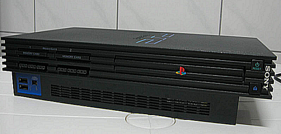
If only the designer of the PS2 had looked at classic console designs and been influenced by them. Instead, we got a monstrosity that made you think "Why does it look so weird?" and "Why does it feel so cheap?" The PS2 design has to be a contender for worst console design ever. The Dreamcast - especially the Japanese version - is in the Top 5 nicest designs. But they turn yellow.Originally posted by Superman Falls View Post
 Last edited by Leon Retro; 06-09-2018, 11:09.
Comment
-
True but for DC - Blue Swirl for the win!Comment
-
What?Originally posted by Superman Falls View Post
I mean, the Dreamcast and GameCube didn't have revisions (putting aside the Panny Q which was a contemporary variant), but there are multiple versions of the Wii, Xbox 360, PS2, PS3, Xbox One, PS4... And handhelds have all seen multiple revisions.
If anything, I think this is more common now than it once was.Last edited by Asura; 06-09-2018, 13:29.Comment
-
Yeah, I've never been a fan of the PS2's design; I still think it looks like an air purifier.Originally posted by Leon Retro View Post
I think they wanted it to be disruptive, and it had to be boxy so as to be used by many people as a DVD player.Comment
-
I know this is about Sega and Nintendo, but since we're talking about console designs, I really like how expressive and characterful the PS2/GC/XB gen hardware designs were.
I'm repeating a previous post by myself here I suspect, but you can really see the competing philosophies behind the machines in their industrial design. Sony's black monolith was divisive, but its hard edges, black colouring, motorised disc tray and serious, minimalist UI sent a message that the PS2 wasn't a toy - it was a piece of high end AV equipment.
The Gamecube was diametrically opposed. After the relatively sombre N64, they gave us a purple box that was cute, fun and approachable. With its little handle for carrying it about, and its multicoloured pad that looked like a Bop-It!, it was a reminder that, unlike the PS2, it WAS a toy, and it was owning it. It was all about fun.
Xbox on the other hand was, essentially, a PC lying flat, with everything that implies. Microsoft wanted you to know that this was the most powerful console, and they did so but not aiming to make it anything less than absolutely massive (with a massive pad). It was aggressively masculine and 'hardcore', like multicoloured LEDs in the seethrough side of a PC case. The green and black, Matrix-inspired 'hacker' style UI added to the not-for-noobs vibe.
We've had some nice console designs this gen - I really like the gen 1 PS4, and how its diagonal lines make it feel like it's surging forward, and the One X is simply a lovely piece of minimalism - but none that have so comprehensively expressed their creators' different intentions for their machines. Except maybe the Switch, which is like a smart millennial version of the Wii for 20 somethings.
Anyway this has drifted OT, but I hope people find my musings interesting!Comment
-
Originally posted by Superman Falls View Post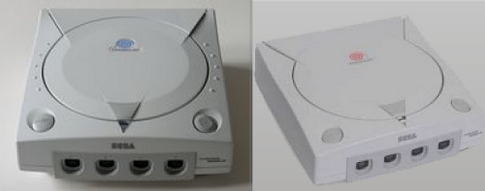
The Euro version is also greyish compared to the Japanese version. I prefer the red/orange swirl.
Yeah, some dodgy cheap purifier from China.Originally posted by Asura View Post
I can see that Sony were going for a "monolith" sort of design, but they got it very, very wrong. It looks extremely ugly, like it was cobbled together, and there's a cheapness to how it looks and feels. I wish it did have the looks and build quality of a high end piece of AV equipment.Originally posted by wakka View Post
I remember people joking about how the GameCube was a toy and for kids. I've always liked the design, but at the time lots of gamers thought that it must be aimed at kids.Originally posted by wakka View Post
Microsoft just bought off-the-shelf parts, so they had to put it into a big box. The company didn't sit down and design a unique chipset and case design. It was all about having a system powerful enough to run DirectX games. But as much as the machine would never win design awards, I think MS did a decent job of making a big box look quite attractive.Originally posted by wakka View PostLast edited by Leon Retro; 06-09-2018, 14:48.Comment
-
Not a fan of the PS2 design either. But it does have one big plus that could have been somewhat deliberate - unlike just about any other system before that (and some since), it could sit under a telly and have other things on it and it would basically vanish, becoming invisible and yet the tray still accessible.Comment
-
Admittedly the biggest problem with many of these consoles is that they're all designed to not have things on top of them. That was the weakest thing about the original Xbox to me.Originally posted by Dogg Thang View PostComment
-
At least the PS2 slim gets the incredible shrinking console award... the PSone was impressive, but in comparison the 2 slim is tiny.
And blue swirl FTW!Comment
-
Gotta buck the trend here, I'm a fan of the PS2 design
It's an odd one, but I think it looks great standing vertically. Even better with the SCPH 10000 external HDD, like a mini city skyline.Comment
-
I prefer the big one too. I'm actually on the look-out for one in decent knick.Comment
-
Originally posted by wakka View Post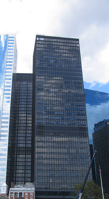
A New York City skyscraper. I wonder if it's Sony's American HQ?
The little building makes me think of 'Batteries Not Included'. Last edited by Leon Retro; 06-09-2018, 23:03.
Comment
-

As Dev Kits go, it’s quite a beauty...Comment
-
NES v Master System is close, but the NES shades it for its Mario games, RC Pro Am and the excellent port of one of my favourite arcade games - Kung Fu Master. I do like the Master System ports of some Sega arcade games, though, especially Shinobi.
SNES v Megadrive is also close but this time the Megadrive just shades it for its excellent range of Sega arcade games, especially Golden Axe, which I play through at least once a week still now.
Nintendo 64 v Saturn is no contest. The Nintendo 64 thrashes the Saturn hands down. I take the point that you can only judge the Saturn really if you have a Japanese (or modded) one, but I didn't, and during its time there was nothing on it that really appealed to me over the PlayStation and the Nintendo 64, while the 64 had Zelda, Mario 64, 1080, Jet Force Gemini, Perfect Dark, Goldeneye and, best of all, Wave Race.
Gamecube v Dreamcast is another thrashing, and this time it's Sega that wins. I don't really like anything on the Gamecube all that much, but especially disappointing was the launch sequel to the my favourite game of the previous generation. Wave Race Blue Storm is awful compared to its predecessor. By contrast, the Dreamcast had bright colorful, amazing games. Powerstone, Crazy Taxi, Soul Calibur, Space Channel 5, MSR, Jet Grind Radio - those were amazing days.Comment
Comment