ugh! For gods sake, Yoji Shinkawa goes to so much trouble creating some of the most beautiful ink brushwork I have ever seen, only for some localising fool to think, nah, real artwork isnt what people want, Ill bung any old CG crap onto the front.
Sometimes people, I really must wonder.
On the bright side: The Ffrench cover art for MGS:TS (and possibly the UK?) has a beautfiul ink brush work piece overlayed onto a red background. Very eye catching and absolutely beautiful. Id hang it on my wall certainly enough.
Sadly, could not find a google image of it, can anyone else provide a pic? The black ink on red PAL cover.
it's not so much terrible cover art as an example of how so much gorgeous, unusual japanese boxart is ground into cg rubbish for the west, but i still have issues with this:
and this:
as opposed to this, which i *love*. it's glittery! glittery boxart could make me buy anything... and lovely, stylish flat-shading.
And I dont know why, since there are ample excellent artists in the West, in and out of the industry.
Ironically, GTA:VC, a game lambasted by too many for being a "casual gamers" game, (even though its one of the best games Ive played), actually has some excellent hand drawn flat shaded artwork. Some of the best western art Ive seen in fact, the panel work feels strangely pop-art esque.
Why so many artists feel the pointless need to shade the edges of everything I dont know, it gives people a freaky bloated look to them.
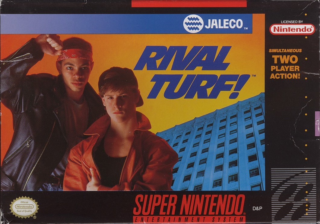
Anyone remember the UK Mystical Ninja SNES box?
<shudder>
I don't know, I sort of like that SNK artist who did the Metal slug cover... he remains true to the source but without attempting to match the art style. Have a look at his cover for the GBA reissue of Super Daimakaimura:
Look at Princess Prin-Prin, what a fox! Especially considering that in the actual game, she looks like .
darwock: oh, all right, it can have *some* points, but it's just not the same as glitter...
on cg art: yep, it's a big part of why so many western game boxes look so damn samey, although i suspect it's more the generic style the artists are encouraged/trained to use (which also crops up in a lot of drawn/painted/*shudder* airbrushed western covers) than the medium itself - it's totally possible to produce stylish, unusual cg art (completely off the top of my head, check out rustboy for an example). it's just that it never seems to show up on game boxes.
i won't make any assumptions about the mindset of japanese gamers or publishers (since my only real interaction with japanese culture is through games, anime and a quiet love of san-x tat), but they really do seem to get a lot more interesting boxes over there. i kinda think the sameyness here and (much more so) in the states is down to publishers tailoring boxes to the uneducated consumer - they're working on the assumption that anyone who's read reviews, preordered or whatever will be looking for the name above all else, so they aim the actual art at customers who're browsing the shelves looking for something interesting instead. and, i guess, the thought process from there is that the more familiar and less threatening the look of the game, the more likely it is to be picked up. which, of course, leads to a lot of homogenised shelves full of burly men, t+a female ninjas, samey, non-threatening cartoon characters with 'attitude' and big explosions. as to whether the japanese publishers do the same thing but assume japanese gamers are more attracted to quirky, eye-catching art or whether they're operating on a totally different principle, i dunno.
oh yeah, and i've always liked the pop-art/early-80s-comic-book look of the gta boxes and character art. shame i never really got on with the games, really, but violence against human targets in games kinda puts me off these days. it never used to, so i really don't know where that's come from. i'd say maybe it's age, but i'm only 21 and immature as anything... [/url]


 .
.


Comment