
That might stand a chance of being good if they got rid of the photorealistic (WHY?) girl and made the composition a little nicer by actually moving things into place...
-
-
They should let some of the designers on here have ago at some box art. We could do much better than the guy who designed that.Comment
-
That Echochrome cover gradually gets worse as you move down the box.
The weird blocks at the top, yeah thats ok.
The squigly writing, not bril but exceptable.
The rainbow, unnecesery.
The half a random womans head...ok now its awful.Comment
-
You know you're playing too many games when you describe an actual photo as 'photorealistic'. But then, I think sometimes I can see polygons and repeated textures in everyday life...Originally posted by Lyris View Post
Yep, this cover is pretty hideous.Comment
-
Oh come on, bless him, he probably thinks this is a game. But maybe it is... O.oComment
-
I don't know what to do about this. Is this cover bad? it looks bad, but on the other hand it could easily be the most awesome game cover ever. More game covers should have explanatory speech bubbles.
Mario Galaxy would have sold twice as many copies with "I AM A PLUMBER!" plastered over the frontComment
-
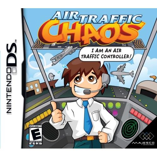
Bit worried about that plane on the right Lie with passion and be forever damned...
Comment
-
Yep that's bad. The "I am an Air Traffic Controller" just screams "Maaatt Daaamon!"
Flight 815: "Come in Control Tower we need an emergency landing!"
Tower: "I am an Air Traffic Controller"
Flight 815: "What? Control Tower we need an emergency landing please clear a path!"
Tower: "I am an Air Traffic Controller"
Flight 815: "For the love of God! Clear the runways we..."
Tower: "I am an Air Traffic Controller"
Flight 815: "OH JESUS CHRIST NOOOOOOO......!
*static*Comment
-
The best thing about this cover is the bottom right photo still has the "iStock photo" watermark on it!Originally posted by PeteJ View PostComment
-
GOW2 cover image: Marcus Fenix scowling, with "I AM A SPACE MARINE" floating above his head in comic sansOriginally posted by toythatkills View Post
also, that cover with visible watermarks is beyond terribleComment
-
Close, actually I immerse myself totally in animationOriginally posted by Dogg Thang View Post
Comment
-
I saw this on another site the other day where it was compared with the Japanese boxart. I know it's practically illegal to say this, but I think the US box is better. I mean, look:Originally posted by toythatkills View Post

Dullsville, right there. At least they've tried to make the American version look fun.
Comment
-
The American one looks amateur and cheap, whereas the Japanese one just looks dull, or functional depending on your point of view. I personally think the US one is the shinier turd.Comment
-
It's hard to believe it's the same game in those boxes. The Japanese version looks like it'll be an ultra serious air traffic sim, the American version looks like it's for 4 year olds. Regardless, I sort of want itComment
-


Land Before Time called and it wants its characters back

Forgot the word "Mutant" from the title of this one

They're bringing the Disney rip offs to the DS now too

Comment
Comment