
Ick. Looks like a free demo disc.
-
-
Have we had this one?

Comment
-
That's not too bad. Although, his head does seem disproportionately large compared to his hands...Comment
-
In an attempt to better my Cho Aniki cover from a couple of weeks back:

I know this one isn't a game but it's almost there and it's very definately bad:

Comment
-
It seems there was a sequel too:


Comment
-
This one is kin of the opposite... His gun is a canon compared to his head!Originally posted by monomaniacpat View Post

Comment
-
-
-
Good call, I was gonna post this today! Shocking isn't it?Originally posted by monomaniacpat View Post
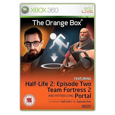
Great game, lousy boxart!
Comment
-
I must say that this is rubbish. The two wrestlers look as if they've just been cutted and pasted on. The guy in the mask looks as if he's going to land behind the other one. The scale looks wrong.

Comment
-
The bloke in the black shorts looks like he is holding a wrestling themed lolly in his left hand!
EDIT:

Don't know about you but I think that screen shot is pre-rendered!!!

I believe that this was the last game cover they designed beore they went to jail, jail, jail!Last edited by JP; 28-10-2007, 20:42.Comment
-
It was supposed to just be an orange box with the names of the games on it, but people were complaining at the crappyness so they put an even crappier cover...Originally posted by AllYourBase View PostComment
-
The first time I saw the box I thought it was a promo cover not the real thing. It looks so cheap, like a pirate cover that was made in some nerds bedroom.Comment
-
Reminds me of the early Official PS2 Magazine coverdiscs, that. Bloody horrible. Is it seriously real? For a magazine-based 'freebie', it's almost acceptable, I'll submit. But as an actual game cover...Originally posted by monomaniacpat View Post
Bleedin' 'ell.
Comment
-
It's really disappointing. Half Life has such iconic imagery and they were so much better off with the older cover:

That does everything it needs to do and either that or a variation on that theme would have been perfect!!!
Comment
Comment