
I smell a new thread coming.
-
-
-
^
rofl.Comment
-
Heh! Good one, Fuse!
Just found this thread from 2005:
Comment
-
My feelings exactly. I'd put the PC Engine way out in front past everything else. So small. So cute... And just a brilliant little machine.Originally posted by ikobo View PostComment
-
I'd pretty much disagree with everything you have in your list the jaguar with cd add on looks like a camping toilet for a start and the megadrive 2 takes the megadrive and makes it look cheap.Originally posted by averybluemonkey View Post
I remember seeing a poster for the original megadrive And coming from the nes shoebox it looked so sleek and futuristic at the time.Comment
-
I think it looks more like a spaceship myself, the proportions are all wrong for a toilet. The thing that's so great about it is how the console was built with the modularity in mind from the ground up, installation just involves plugging it into the cartridge slot like a game and connecting one power cord, job done. Compared to the nightmare of the Mega Drive add ons it's a breeze. Plus it has the coolest font design ever with the red Jaguar ending in a tear mark.Comment
-
- PAL SNES/ SFC
- N64
- Dreamcast
- Gamecube
- Original 'phat' PS3

Comment
-
Again I would disagree the font looks like it belongs on the cover of primal rage it's certainly not cool. Onto your built with modularity in mind comment I'm not sure how releasing half a console is ever a good idea add ons historically never work it didn't work for sega and it didn't work for atari, and if Atari knew anything about good design it wouldn't have brought out a console with that pad.Originally posted by averybluemonkey View Post
But this is all subjective one mans masterpiece is another mans abominationComment
-
1. Wii
2. Gamecube
3. NES
Main reason because they are not curved and easy to stack. I just really hate this curvy nonsense, it is not like they have to resist drag.Comment
-
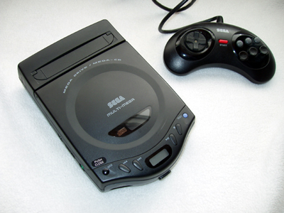
1. Multimega. So much stuff in a tiny understated system.
2. The Megadrive mk 1. Despite its age I don't feel it has dated much at all.
3. SEGA Mark III. I can't put my finger on why I like this system so much but I think it looks great. 4. Sega Saturn (white version). Lovely smooth looking system with rounded edges and corners. This is the colour scheme that should have been used from launch in all regions.
5. Dreamcast. Neat little system low on decorative pieces and uses one colour that differs from the case to highlight the parts you interact with.Comment
-
#1 has to be this:

The other four require some actual thought/research.Comment


 , I really hate glossy plastic.
Comment