
Originally posted by Boris
View Post
-
I really like the thickness of this. But also, I like that the arrow goes below the bottom section. It's like it feels like it's definitely going down, rather than around. Can't play around with it myself right now as I'm supposed to be playing games but I'll have a go at seeing what else I can bring to it tomorrow at work. -
How's about no logo as such?

Comment
-
I like that idea, but not that font. Pixelly fonts on games sites are really clicheComment
-
You know what is clic??
Not making the ?!
What font is in your logo? I like that oneComment
-
It's "Moire," which I only really used 'cause it's the coolest looking font I have
There might be nicer onesComment
-
-
Just one off the top of my head:Originally posted by toythatkills View Post

I'm also not talking about it being round the text only, necessarily. And I mean really subtle, the kind of shadow you only notice when it's on a dim/bright background.
Here's an example (may not be a good one as it's been a while since I did this with PS):

Without a shadow ^

With ^
Might need to tone it up a notch for such a clash, but you hopefully can see some difference, especially around the letter N.Comment
-
Yeah, that is slightly clearer, but it's not as clear as the top one I posted with wob text, it'd just be a case of using it differently depending on what the background of the banner was. A light clear background would work ace with the bottom type of thing I posted, whereas busier ones would work with the top two in various colours.
That is a lot more subtle than I was picturing it in my head, thoughComment
-
TTK's gave me a couple of revisionist ideas on the theme...
 Lie with passion and be forever damned...
Comment
-
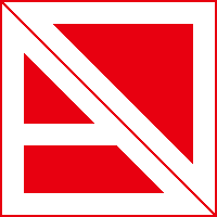
Like that 2nd one. It's like fast forward.Comment
-
This is cool. Although I think it would work better with an arrow shape at the bottom as well as the top of the break (it's currently flat).Originally posted by toythatkills View Post
As for the picture inteferring with the text, it doesn't matter. And I don't have to make it transparent to the banner all the time.Comment
-
The one above is nice and simple and feels like something that would be appropriate as a finished site logo. I know it's changeable per banner but I'm not keen on the black version used here, it doesn't 'pop' anywhere near as much as the current NTSC logo does in the banner, for me it has to stand out as it's the site's identity it's promoting, much prefer the version with the red logo which parallels the red logo on the arm really wellComment
-
Just a variation based on Boris' version...


Edit: And a couple more. More later maybe...

 Last edited by Dogg Thang; 23-08-2011, 08:03.
Comment
-
I like the first one. The wide borders look good and the font is stylish too.Comment
-
Combined the text with the logo so it feels a part of it, then you can remove the border and play with it a more on banners with trancparencies and stuff. And on busier banners, the white text in the first one can stay white (while the arrow goes transparent) so the text is always clear.Originally posted by Dogg Thang View Post


(sorry for quality, you get the idea)Last edited by toythatkills; 23-08-2011, 09:04.Comment


Comment