Announcement

Collapse
No announcement yet.

The bad boxart gallery

Collapse
X
 
  • Filter
  • Time
  • Show
Clear All
new posts

    no! no! the DC artwork is perfectly formed and subtly realised.

    the core artwork on the xbox cover is someone's bad (as someone said, GCSE-style) copy of the DC artwork, and it looks terrible IMO.

    Comment


      This thread has apparently been criticised by RedEye in this months Edge.

      And I thought I needed to get a life...

      Comment


        I can't imagine what he can kick off about in the column, but I'll buy it in a few days and find out

        Comment


          Surely we have a winner

          Comment


            cool, just found this topic, are there any newer updated box art topics?

            I always cringe and find it sad, that gaming being an artform in itself has to so mercilessly have its cover art butchered.

            and there are so many examples its unreal.
            I mean seriously, Id bet most of us here could do better than the US megaman box art. Some of this stuff is so bad, and poorly realised I wanna scratch my eyes out.

            heres another bad one:


            jeez, they totally butchered riki kunio's Japanese art.
            By Technos, the ones who river city ransom.

            A quick ebay search will bring up the beatiful original riki kunio art.

            Read in a previous post, Redeye criticised this thread?
            Could some tell me which issue and tell me the gist of what he said, Id like to notch it down on my 101 reasons why I hate redeye list.

            Lets keep this topic alive, this kind of stuff, as painfull as it is to witness, needs to be seen in order to ensure the future sirvivial of cover art everywhere. You know your duty, burn a game box today.

            or simply post more pics, your choice....

            Comment


              Originally posted by otaku84
              cool, just found this topic, are there any newer updated box art topics?

              I always cringe and find it sad, that gaming being an artform in itself has to so mercilessly have its cover art butchered.

              and there are so many examples its unreal.
              I mean seriously, Id bet most of us here could do better than the US megaman box art. Some of this stuff is so bad, and poorly realised I wanna scratch my eyes out.

              heres another bad one:


              jeez, they totally butchered riki kunio's Japanese art.
              By Technos, the ones who river city ransom.

              A quick ebay search will bring up the beatiful original riki kunio art.

              Read in a previous post, Redeye criticised this thread?
              Could some tell me which issue and tell me the gist of what he said, Id like to notch it down on my 101 reasons why I hate redeye list.

              Lets keep this topic alive, this kind of stuff, as painfull as it is to witness, needs to be seen in order to ensure the future sirvivial of cover art everywhere. You know your duty, burn a game box today.

              or simply post more pics, your choice....
              Don't worry, we're definately keeping this alive at gamesTm
              Expect lots of dps lovliness from next issue

              Comment


                Originally posted by replicant
                Sometimes I shudder when I see the cool, and intersting Japanese Game artwork lost to substandard Western covers like these ones.

                Mobile Light Force 2 is an example of how a crap US devco, takes a perfectly good JPN shooter and ****s it up. It needs to be avoided not just for the crap cover, but for the goodness of gaming.
                Redeye was bitching about this I believe, how we hate the American box art to mobile light force 2. Wasn't actually fair considering every goddamn issue Edge is far more anal about box art than we ever are, even telling you to buy the much more expensive Japanese version of a game for the box art alone.

                His point that it was aimed at the massmarket is invalid. Who the **** in the mass market buys japanese shooters when THUG: We've run out of numbers is on the shelf next to it?

                Besides, I can bitch about conversion jobs if I want to. Take Halo, Gearbox really ****ed up the PC port. Doesn't matter if it is aimed at PC gamers, they still ****ed it up. I can think whatever I want.

                Besides, as forums go, we're rather positive about most things in life.

                Comment


                  a feature on bad cover art in gamesTM?
                  damn, glad I subscribed now! my first issue is due dec 3rd apparently.

                  Ill be sure to tell you what I think.

                  cheers

                  On a positive note:
                  Lets talk about good cover art in the west:

                  Skygunner on PS2, thank goodness they kept the excellent pencil drawn cover, beautiful. Anyone got a link to it? I cant find one sadly.

                  Also, I want to mention PAL games, surprisingly, sometimes we get better covers than our USA bretheren. ICO being a fine example.

                  Are there any cases of Western art being better than Japanese art?
                  I could mention a couple, but theyre just off the tip of my tongue.

                  I quite like some western cover art, when its a case of less is more, like the British Resident evil GC box art. Quite stylish. the usa version was just silly with a cg pic of a zombie and jill.

                  Comment


                    Yeah Halo for starters. This is the Japanese box art:


                    As far as I can tell this is what the Japanese buy, my Japanese isn't that good! Actually it is non-existent, oh well.

                    What a pile of crap. Makes it look like some sort of survival horror game.
                    Fails to get across the epic sense of the conflict. Indeed the Western Halo box art is eerily reminiscent of the vast conflict depicted in the box art for Transformers the Movie. It is interesting to note that the Region 2 box art is superior to region 1. This is the movie poster but the box art is near identical except the top phrase is replaced with the superb:

                    "Beyond Good. Beyond Evil. Beyong your wildest imagination"

                    Comment


                      just because there should be more flagrant homoerotica in video games:

                      ai cho aniki on the pc engine


                      ...and cho aniki seinaru for ps2. which, despite having played the hilarious-but-****ing-awful snes fighting game, i suddenly sort of want to import.


                      i'm not really saying this is bad boxart. just... weird, i guess.

                      Comment


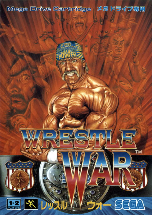
                        Wrestle War Pal


                        Jap.. oh look.. its not Hulk hogan

                        Comment


                          Ah i love this thread.
                          I still stand by my comment earlier on in this thread on how awfull the Halo boxart is, for all regions it seems. Though the Jp one a few posts up is slightly better.

                          Comment


                            Originally posted by Jay
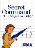
                            Some of the early Master System boxes are good for a chuckle.


                            Check out the sonic waves eminating from the underside of his rifle.
                            I agree some of those early Master System boxes were so plain and crap. It was like some of them were designed by art students at primary school. Though sega have always taken the cheaper option!

                            Comment


                              this thread is so funny, i've been sitting here laughing so loudly Loved the crapiness of the mega man. the gamespy comment was hilarious
                              "Capcom Marketing Guy: Hey, I need you to whip up some box artwork for a new state-of-the-art high-resolution Game Pak we?ve got. It?s called Mega Man.
                              Artist: What?s it about?

                              Capcom Marketing Guy: Beats me, some guy who?s like ... this man with ... mega powers, I guess. He?s like Superman I think, but he wears blue armor and has this arm cannon thing.

                              Artist: OK, well, I?ll just draw a picture of a syphilitic old man wearing blue and yellow armor because I really like the color yellow. Also, instead of armor, I?ll just give him a futuristic t-shirt with extra long sleeves that bunch up near the shoulders and elbows. I don?t know what an "arm cannon" is, so I?ll just give him a ray gun pistol and have him hold it at this really awkward angle. Oh, and I?ll put this white burst of light behind his prominently exposed crotch and have him standing in a field of giant colored contact lenses?

                              Capcom Marketing Guy: (interrupting) Yeah sure, do all that, and add like a futuristic Tron Tic-Tac-Toe thing in the background while you?re at it. OK, gotta go, bye!

                              "

                              haha top thread guys !

                              Comment


                                As a kid of about 4 or 5 even I knew that the boxart for some of Sega's stuff was absolute ****. Especially anything on a white background and grid.

                                Comment

                                Working...
                                X